 Open noramble.co.uk
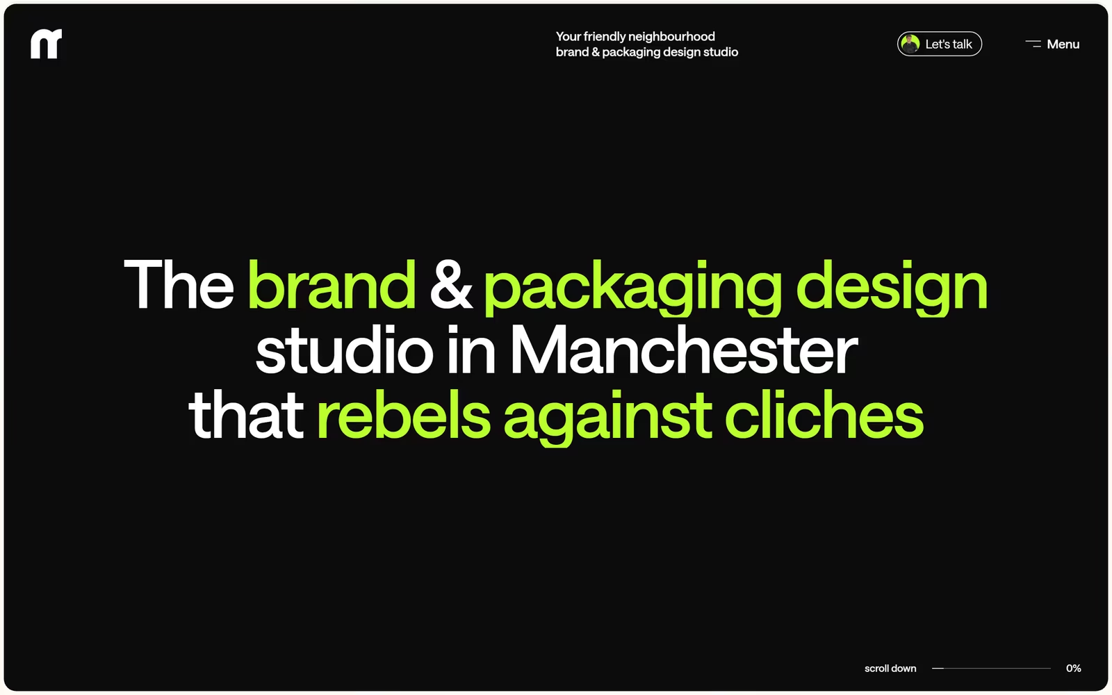
Noramble's website is a confident example of dark typographic web design for a branding and packaging studio. The hero deploys oversized rounded-sans type at display scale, using a lime-green accent to selectively emphasise key phrases against a near-black background — a technique that communicates personality without relying on imagery. This dark studio website design balances minimalism with character, making it strong inspiration for agency and creative studio sites seeking bold typographic identity. The restrained layout and scroll-progress indicator in the corner add functional polish to an otherwise expressive composition.
What stands out
The two-tone typographic system — white body weight contrasted with a vivid #9BF53A lime — is the defining craft decision, turning the headline itself into a brand asset. The rounded geometric sans-serif at display scale fills the viewport with authority while the pill-shaped CTA button and minimal nav maintain clean hierarchy.
About Noramble's design
What makes Noramble's website design effective?+
Noramble's website is a confident example of dark typographic web design for a branding and packaging studio. The hero deploys oversized rounded-sans type at display scale, using a lime-green accent to selectively emphasise key phrases against a near-black background — a technique that communicates personality without relying on imagery. This dark studio website design balances minimalism with character, making it strong inspiration for agency and creative studio sites seeking bold typographic identity. The restrained layout and scroll-progress indicator in the corner add functional polish to an otherwise expressive composition.
Want a site this good?
SEOJack designs websites that look like these — and rank.
We build fast, beautiful, search-optimised websites for businesses. Inspiration here, the real thing there.