 Open locomotive.ca
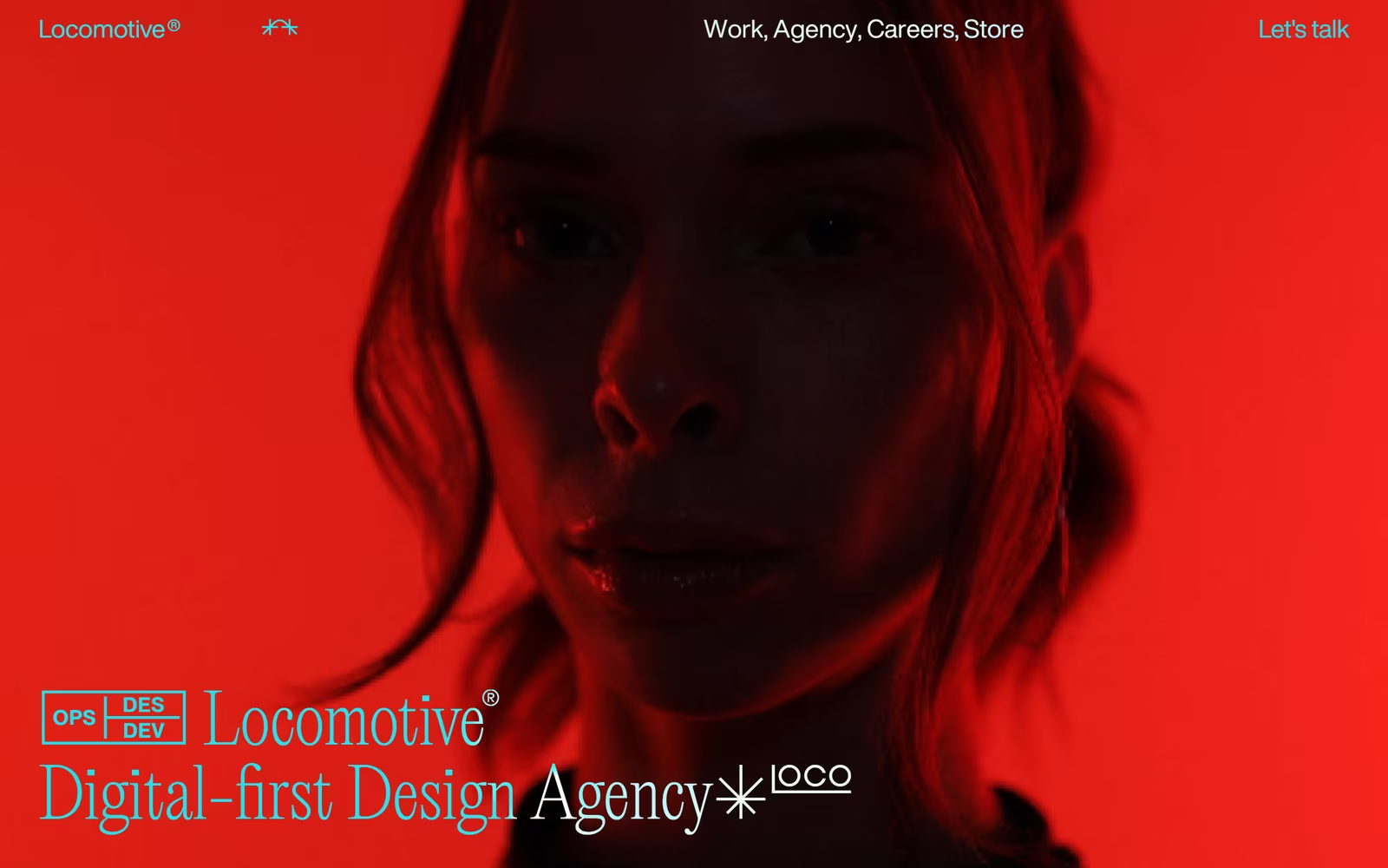
Locomotive is a standout example of dark editorial agency website design, pairing a vivid scarlet hero image with a cool cyan typographic system to create immediate visual tension. The mixed-weight headline — blending a geometric sans with a lighter serif weight — demonstrates sophisticated typographic hierarchy rarely seen in digital agency web design. The OPS/DES/DEV badge system and asterisk motifs add a systematic brand language that elevates the layout beyond a typical portfolio homepage. This is compelling web design inspiration for anyone studying how colour temperature contrast and cinematic photography can anchor a digital-first agency identity.
What stands out
The electric cyan-on-red colour pairing is bold and deliberate — a warm/cool split that creates instant drama without sacrificing legibility. The oversized mixed-weight headline with inline iconographic glyphs (asterisk, underlined 'loco' wordmark) shows a refined, editorial typographic system with strong brand consistency.
About Locomotive's design
What makes Locomotive's website design effective?+
Locomotive is a standout example of dark editorial agency website design, pairing a vivid scarlet hero image with a cool cyan typographic system to create immediate visual tension. The mixed-weight headline — blending a geometric sans with a lighter serif weight — demonstrates sophisticated typographic hierarchy rarely seen in digital agency web design. The OPS/DES/DEV badge system and asterisk motifs add a systematic brand language that elevates the layout beyond a typical portfolio homepage. This is compelling web design inspiration for anyone studying how colour temperature contrast and cinematic photography can anchor a digital-first agency identity.
What tech is Locomotive's website built with?+
Our analysis suggests Locomotive uses GSAP.
Want a site this good?
SEOJack designs websites that look like these — and rank.
We build fast, beautiful, search-optimised websites for businesses. Inspiration here, the real thing there.