 Open careofchan.com
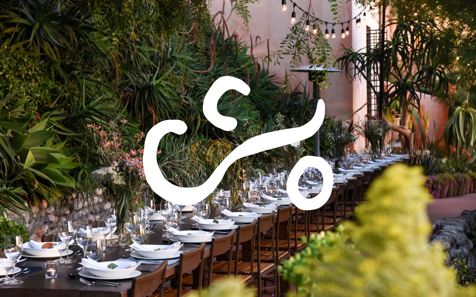
Care of Chan is a standout example of restaurant website design that lets atmospheric photography do the heavy lifting. The fluid, hand-drawn-style logomark rendered in white against a verdant garden tablescape creates immediate visual poetry, making this a compelling reference for editorial restaurant and hospitality web design. The warm terracotta tones of the architecture, the deep botanical greens, and the soft candlelight create a colour palette that feels both luxurious and organic. This approach — minimal UI chrome, maximum photographic immersion — is a masterclass in letting brand identity and environment speak for themselves.
What stands out
The standout craft decision is the oversized, calligraphic white logomark — its loose, gestural strokes echo steam or vines and feel genuinely bespoke rather than off-the-shelf. The full-bleed photography with shallow depth-of-field foreground blur adds cinematic depth that elevates the single-screen composition considerably.
About Care of Chan's design
What makes Care of Chan's website design effective?+
Care of Chan is a standout example of restaurant website design that lets atmospheric photography do the heavy lifting. The fluid, hand-drawn-style logomark rendered in white against a verdant garden tablescape creates immediate visual poetry, making this a compelling reference for editorial restaurant and hospitality web design. The warm terracotta tones of the architecture, the deep botanical greens, and the soft candlelight create a colour palette that feels both luxurious and organic. This approach — minimal UI chrome, maximum photographic immersion — is a masterclass in letting brand identity and environment speak for themselves.
Want a site this good?
SEOJack designs websites that look like these — and rank.
We build fast, beautiful, search-optimised websites for businesses. Inspiration here, the real thing there.