 Open benvenusa.com
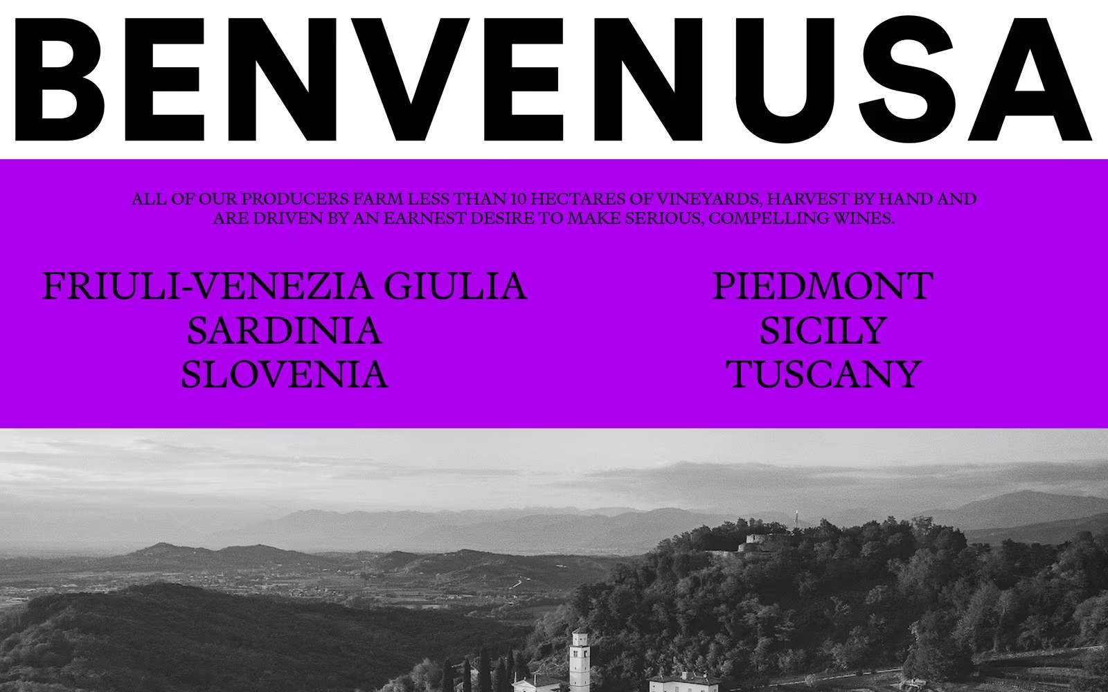
Benvenusa is a standout example of editorial wine website design that rejects the expected rustic-and-earthy aesthetic in favour of brutalist typographic energy. The oversized condensed wordmark, vivid magenta-purple colour block, and all-caps regional listings create a high-contrast layout that feels closer to a fashion zine than a traditional wine importer site. This approach to bold typographic web design makes it immediately memorable in a crowded category. The monochrome landscape photograph anchoring the lower section provides tonal relief and grounds the otherwise electric palette.
What stands out
The pairing of a heavy grotesque display typeface at near-full viewport width against a flat electric violet (#CC00FF-adjacent) block is the defining craft decision — it deliberately subverts wine industry conventions. The two-column region listing on the purple band shows considered grid thinking, though overall layout simplicity keeps the tech and UX scores modest.
About Benvenusa's design
What makes Benvenusa's website design effective?+
Benvenusa is a standout example of editorial wine website design that rejects the expected rustic-and-earthy aesthetic in favour of brutalist typographic energy. The oversized condensed wordmark, vivid magenta-purple colour block, and all-caps regional listings create a high-contrast layout that feels closer to a fashion zine than a traditional wine importer site. This approach to bold typographic web design makes it immediately memorable in a crowded category. The monochrome landscape photograph anchoring the lower section provides tonal relief and grounds the otherwise electric palette.
Want a site this good?
SEOJack designs websites that look like these — and rank.
We build fast, beautiful, search-optimised websites for businesses. Inspiration here, the real thing there.