 Open bauhausclock.com
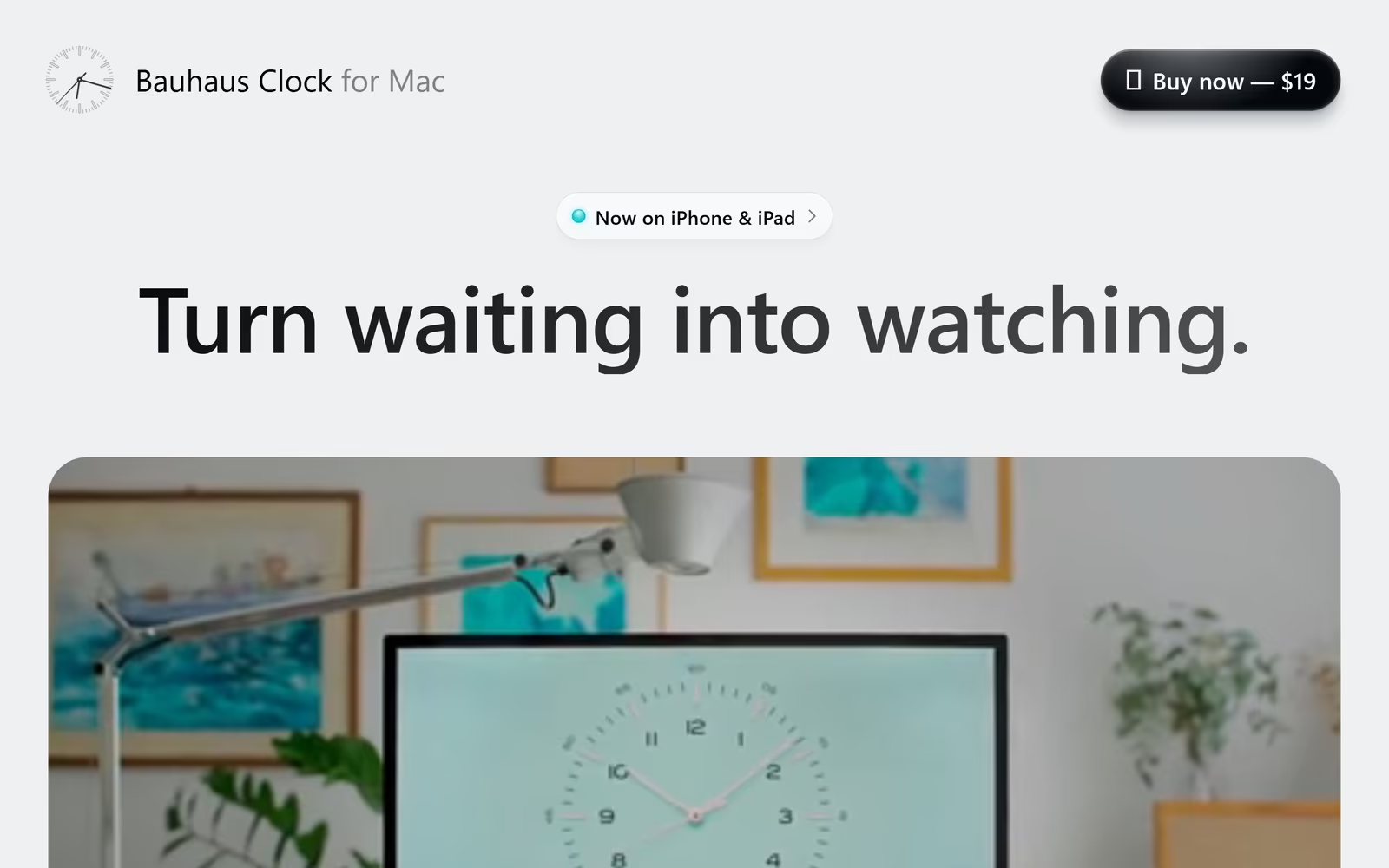
Bauhaus Clock for Mac delivers a minimal SaaS product website design that borrows Apple's own visual language: generous whitespace, a near-neutral light grey background, and a bold geometric sans-serif headline set at display scale. The pill-shaped announcement badge and rounded dark CTA button are textbook modern macOS app marketing design. The lifestyle photography hero — showing the clock face on a real desk setup — grounds the minimal aesthetic in tangible context, making this a strong reference for minimal software product website design inspiration.
What stands out
The headline weight contrast between 'Turn' and the lighter-toned secondary words creates subtle typographic rhythm without resorting to colour. The soft #EBEBED background avoids harsh white glare while keeping the palette firmly in Apple's design territory — a deliberate and effective product positioning choice.
About Bauhaus Clock for Mac's design
What makes Bauhaus Clock for Mac's website design effective?+
Bauhaus Clock for Mac delivers a minimal SaaS product website design that borrows Apple's own visual language: generous whitespace, a near-neutral light grey background, and a bold geometric sans-serif headline set at display scale. The pill-shaped announcement badge and rounded dark CTA button are textbook modern macOS app marketing design. The lifestyle photography hero — showing the clock face on a real desk setup — grounds the minimal aesthetic in tangible context, making this a strong reference for minimal software product website design inspiration.
Want a site this good?
SEOJack designs websites that look like these — and rank.
We build fast, beautiful, search-optimised websites for businesses. Inspiration here, the real thing there.